
When I read a book I have the habit of highlighting certain passages I find interesting or useful. After I finish the book I’ll type up those passages and put them into a note on my phone. I’ll keep them to comb through every so often so that I remember what that certain book was about. That’s what these are. So if I ever end up lending you a book, these are the sections that I’ve highlighted in that book. Enjoy!
I honestly did not enjoy this book. But, I do have the mentality that everyone has something to teach us, and I was still able to find some valuable snippets – so here they are!
“That’s what’s so great about icons, they’re tiny poems.”
When German mathematician Johannes Widmann published his book of arithmetic in 1489, it was the first time we ever saw the + (plus) and – (minus) signs in print.
From the 1880s until the 1940s, hobos who rode the rails across the United States would leave cryptic symbols on fences, footpaths, street signs and railway stops to help other hobos find their way.
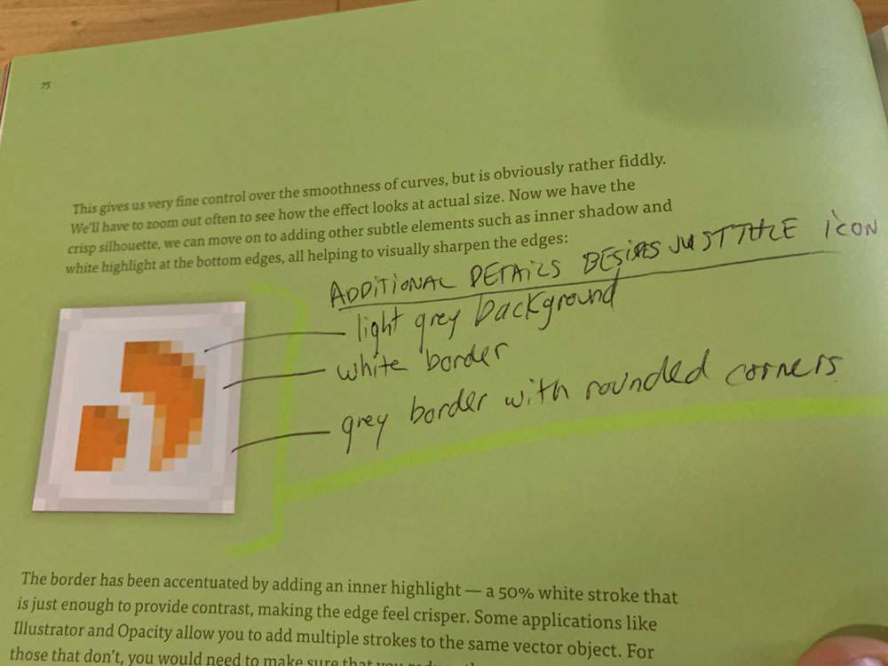
An icon is more than an image, because it embodies properties of what it represents.
1-bit depth basically means either black or white pixels.

While some pictograms may become less useful over time as the objects they represent fade from use, others take on a life of their own and become arbitrary.
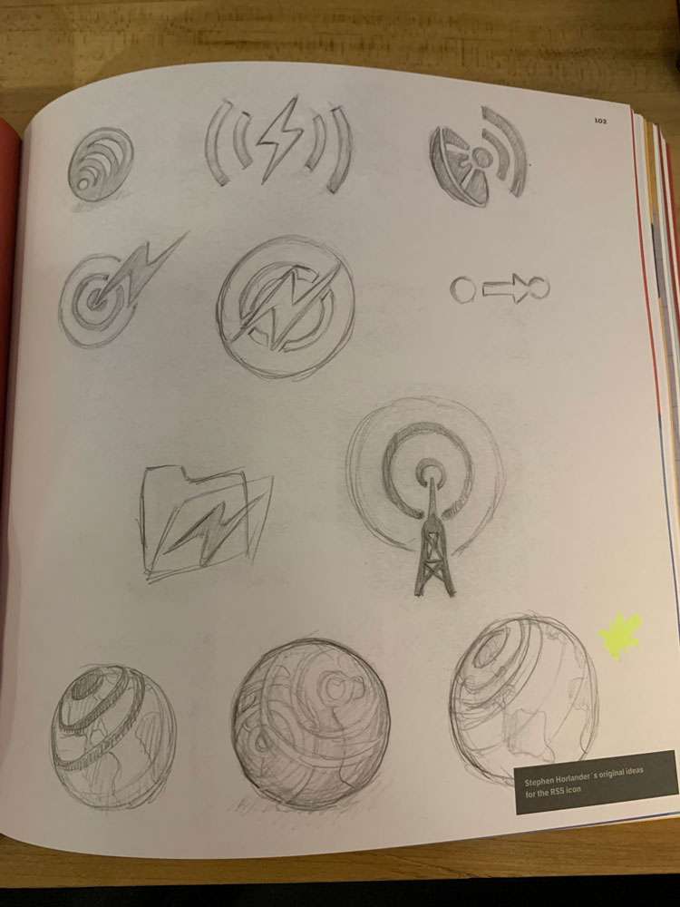
Even once this an icon was chosen, there was a variety of perspectives and stules that could be considered (image below).

Humor, when judged correctly, can entice an user to spend time finding out what a symbol means, as well as making it memorable.
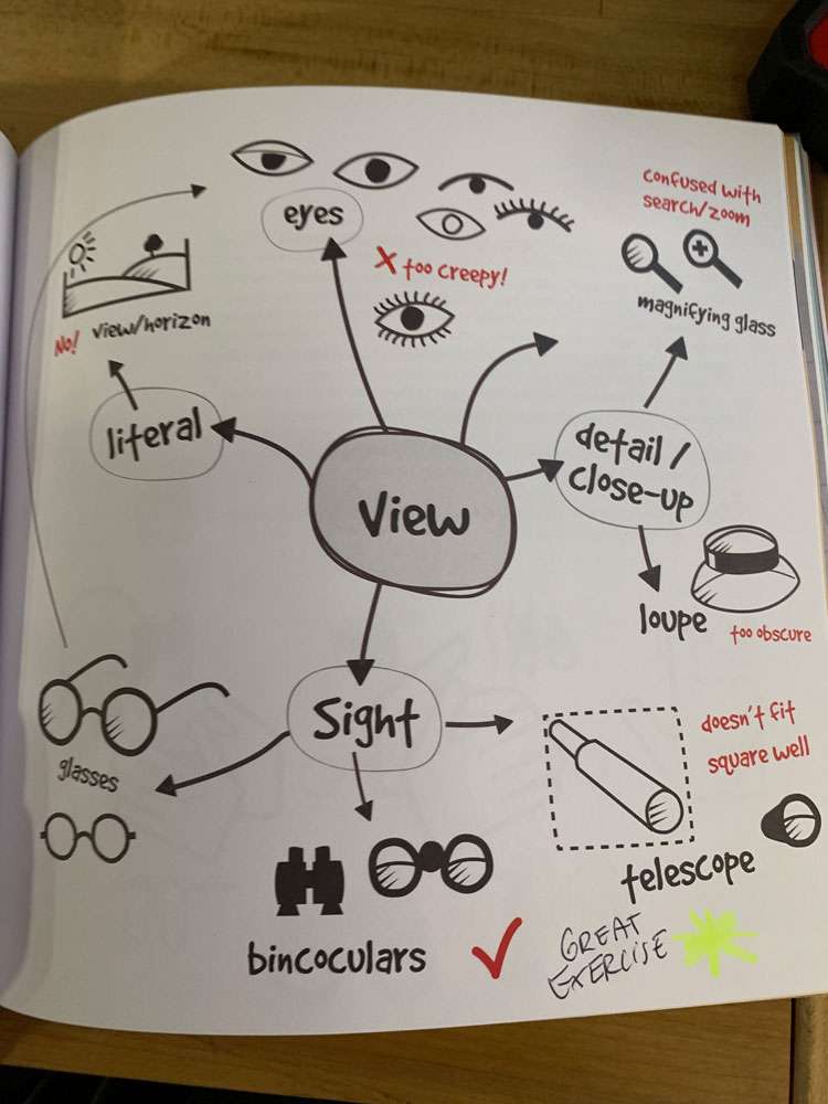
The binoculars metaphor was the best solution for the context because:
- It had a unique profile, reducing confusion with other icons in the UI
- It was a familiar object that could be rendered effectively without looking like other things
- There were no negative connotations
- Most importantly, it communicated view without too many alternative meanings
When stuck on an icon, try looking up the sign language symbol for it to see if that sheds any new light.
@joekotlan on X