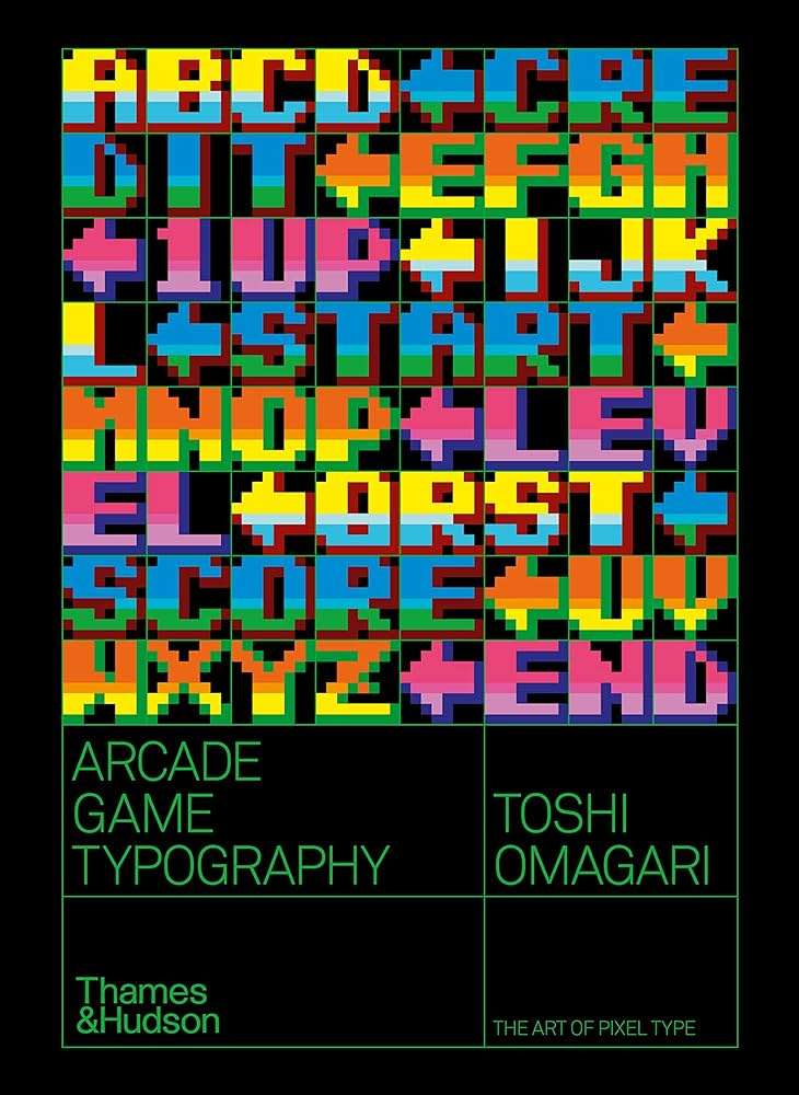
When I read a book I have the habit of highlighting certain passages I find interesting or useful. After I finish the book I’ll type up those passages and put them into a note on my phone. I’ll keep them to comb through every so often so that I remember what that certain book was about. That’s what these are. So if I ever end up lending you a book, these are the sections that I’ve highlighted in that book. Enjoy!
There are very few named type designers in this book, as it is rare to find them in game credit rolls. Japanese game companies had a practive of not listing real names in their credit rolls, fearing their employees would be headhunted by competitors.
Monospaced fonts, with identical character widths, were considered satisfactory for video games, due in part to the fact that most games were made in Japan, where the writing system is also primarily monospaced.
Arcade cabinets generally had a 19-inch CRT display, which in a 4:3 aspect ratio, are 289.56mm high (assuming internal vertical resolution at 224 pixels). The physical size of eight pixels was therefore 10.34mm.
The bold colors used in the typeface in the game Legend are perhaps meant to evoke the American flag, an appropriate palette for this game. It also lacks a lowercase character set; now that’s what I call Capitalism.
At that time, every game graphic was made on graph paper, and then the artwork was coded by hand, one pixel at a time.
As arcade components became more powerful and game developers got more creative with graphics. the Quiz Show typeface in its original form gradually lost its popularity, as it use in games was seen to represent a lack of creativity. facing tough competition against ever-increasing options, Quiz Show;s appearance continued to diversify, especially in terms of its decorations, such as shadows and gradients.
In the post-arcade video game era, the typeface regained its place as the go-to video game font, instantly evocative of coin-op’s pop-cultural status.
In the 60s , when car became common in Japan, cab drivers began to drive at reckless speeds in order to secure more customers and keeo their business compeitive. They became known as ‘kamikaze taxis’ and would go on to inspire Kamikaze Cabbie and other game like Crazy Taxi.
The design of the typeface in Fantasy Zone may not look particularly noteworthy, but in comparison with Tatio’s similar Rastan Saga type you can see it is easy to get caught up in originality and forget to make a typeface work.
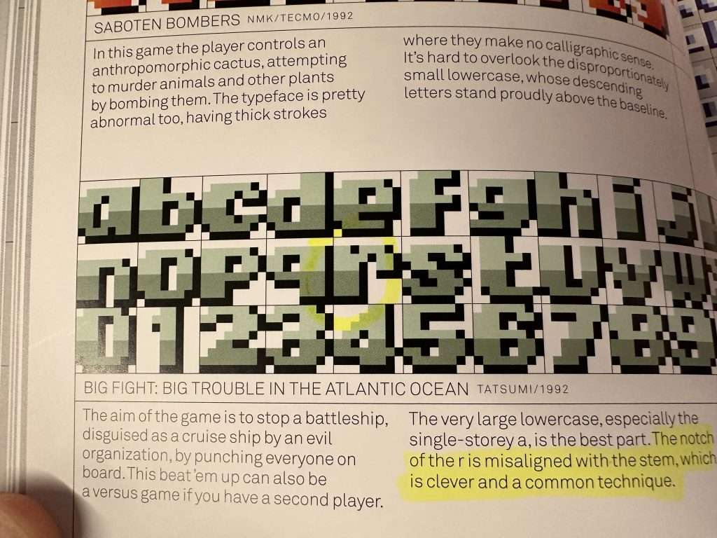

Magnetic Ink Character Recognition (MICR) is a printing technology invented in the United States in the 50s. It users ink containing magnetic iron oxide and a very mechanical numeric typeface that allows the characters to be read by both the human eye and magnetic scanners.
MICR was intended to speed up bank operations by processing numbers mechanically and was used for bank cheques and documents of a similar nature.
In games where science, the future, outer space, aliens and machines were ubiquitous, MICR typefaces were a perfect fit.
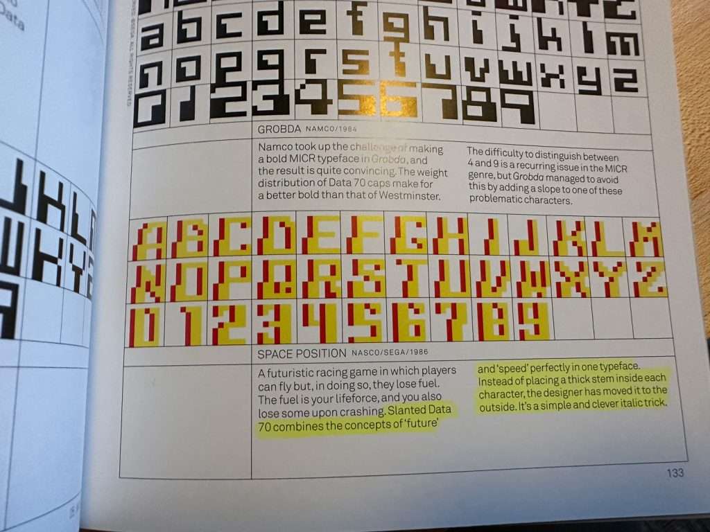
The sequel to Thunder Cross has a very tenuous, and somewhat pointless plot: the enemies from the previous game have come back to life and players need to defeat them all over again. (Who cares, I love this plot)
My theory for why RUB was chosen for character deletion is that the Japanese developers used the first three letters of the word ‘rubber’ the British word for a pencil eraser. Alternatively, there was BS for backspace, RV for reverse, and DEL, DL or a left-facing arrow for delete. The END symbol was also sometimes ED, OK, or the carriage-return symbol. What is fascinating about RUB and END is that three letters are crammed into 8×8 pixels.
Between 1989 and 2000, the North American arcade market mandated the inclusion of an anti-drug slogan that said ‘winners don’t use drugs’ in game attract modes. This FBI drug screen became a staple of 90s arcade games in the US.
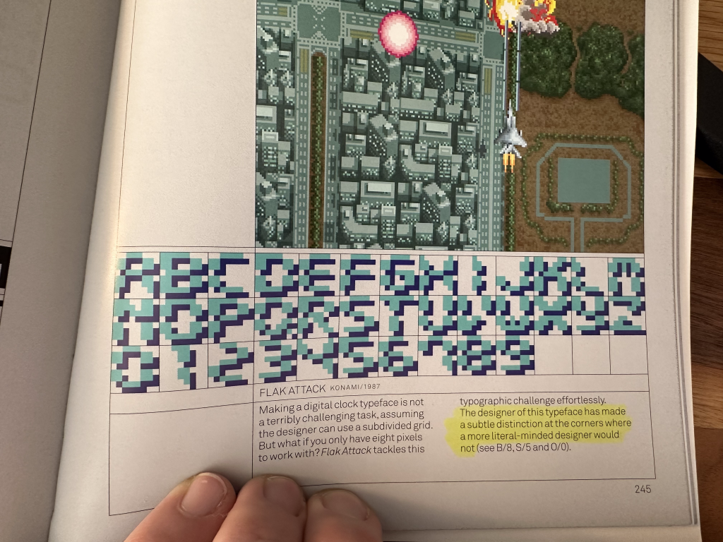
In the typeface for the game Space Panic all horizontal strokes in the typeface are two pixels thick, a style choice made possible by occupying all eight pixels of height. The diagonals remain thin, which may be a result of using rigid logic to thicken the strokes.
@joekotlan on X