
These are just raw notes on App Design. They aren’t necessarily organized in any specific way, this is more of a board to place things I find about the topic. I used to have these unorganized within the notes app on my phone, but by placing them here I hope that someone else can use them too. If you have any questions on the notes or a question on a particular snippet feel free to reach out to me using the form at the bottom of this page.
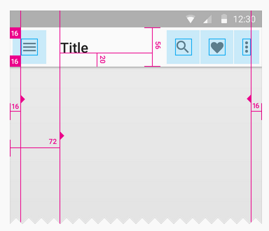
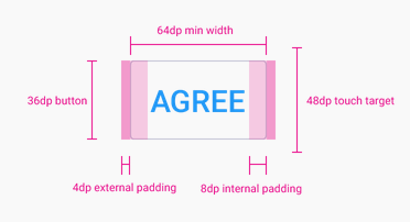
Make touch targets at least 48 x 48 pixels
Spacing between touch targets should be at least 8dp
The minimum touch target size is 48dp. Keep this in mind when spacing icons in a layout. The touch targets shouldn’t overlap otherwise the topmost overlapping icon will always be selected
To ensure retina images, upload just the retina version and then use css to constrain the image to a certain size.
Is this actually a user preference? If not, don’t make it a setting. Organize it into a help screen instead.
When you have many settings:
7 or fewer: don’t group at all
8-10: use 1-2 section dividers
11-15: use 2-4 section dividers’

As much as possible, avoid displaying a splash screen or other startup experience. It’s best when users can begin using your app immediately.
Delay a login requirement for as long as possible. If users must log in, display in the login view a brief, friendly explanation that describes the reasons for the requirement and how it benefits users
When using an Onboarding experience, give users only the information they need to get started. Make it easy to dismiss or skip the onboarding experience.
don’t describe how to perform a simple task when you can use animation to show users what to do
In a hierarchical app, users navigate by making one choice per screen until they reach their destination. In an app with a flat information structure, users can navigate directly from one primary category to another because all primary categories are accessible from the main screen
In general, use a picker when users are familiar with the entire set of values
Contrast draws attention to an element. In other words, an element that contrasts with its surroundings will appear visually heavier than its surroundings. For example, circles usually appear heavier than rectangles on a web page because most website elements are rectangular.
Most people will notice the color of an element before its shape
Diagonals dominate, and because most web pages are not dominated by diagonal directions, they capture more attention
Feng Shui design style is to promote balance and harmony in the space
Information can be organized in five ways: by category, time, location, alphabet, and continuum / hierarchy.
app function should be explained in one sentence, name should not be repeated in the app icon.
@joekotlan on X