
Have you ever searched for that perfect gold hue within the color picker, but ultimately settle on something less than your original expectations? It’s an elusive color to get right, but there’s a reason why you can’t find the perfect shade.
We usually associate the color gold with luxury, royalty, and the most expensive on the market. When done correctly, brands that include gold in their color scheme can appear trusted and time-honored, allowing them to reach a higher-class audience. So how should you go about using it on the web?
The perfect hex
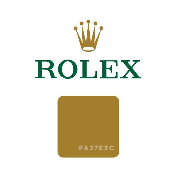
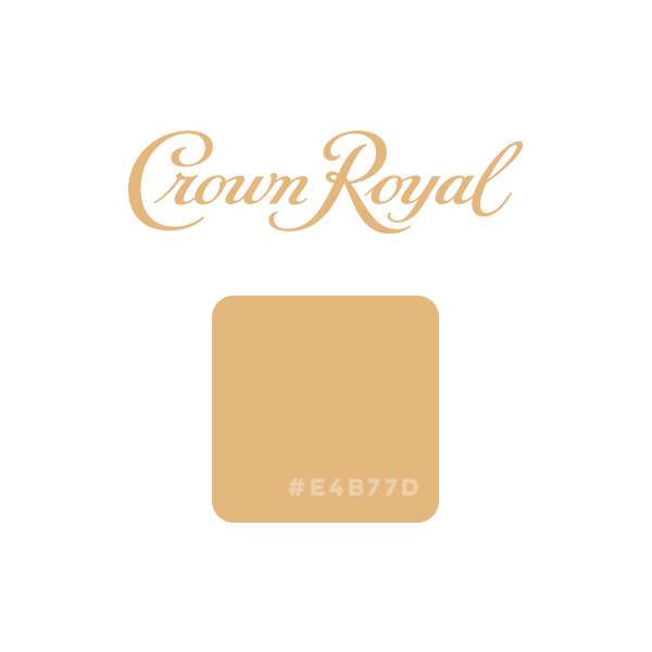
Simply put, it doesn’t exist. The gold color we envision on jewelry, gold bars, or a treasure room filled with golden chalices includes a metallic shine that a single hex cannot reproduce. The shiny effect is due to the varied reflections of light on the angled surfaces of the gold items. There are however many single colors that still give the impression of a gold color, most notably on brands of market giants like Rolex (#A37E2C), Perini Navi (#D5A848), and the newly redesigned Crown Royal (#E4B77D).

There’s #FFD700, which is listed as gold on ColorHexa and also #D4AF37, the official Metallic Gold color from the ISCC-NBS Dictionary of Color Names.

If you came here looking for one single hex, here’s a bunch of close-to-gold hexes. Otherwise, you’re going to need gradients.
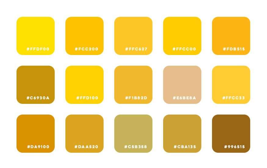
#FFDF00, #FCC200, #FFC627, #FFCC00, #FDB515Second Row:
#C6930A, #FFD100, #F1B82D, #E6BE8A, #FFCC33Third Row:
#DA9100, #DAA520, #C5B358, #CBA135, #996515Using gold color in a gradient
By using gradients we can get closer to a shine effect. If you’re familiar with the Gradient Mesh tool in Illustrator then that’s definitely the way to go, but since not everybody has access to a designer that’s familiar with gradient mapping, regular gradients will do the trick for the web. At the most basic level just take a shade of any of the gold hexes above along with the original color and create a gradient. Add in a darker shade for some shadows and then a near-white shade for the shimmer effect. Feel free to experiment with this to find something that suits you. Here are some combos I’ve found enticing:

#AE8625, #F7EF8A, #D2AC47, #EDC967Second Gradient:
#DFBD69, #926F34Third Gradient:
#F9F295, #E0AA3E, #FAF398, #B88A44Animations can also help create that gold shimmer effect on the web. A simple swipe from left to right with a gold gradient can imitate that shine that we all have envisioned from Hollywood. I haven’t gone too deep into creating the prefect gold shine but I did recently create the below button effect on a site we recently launched. There are plenty of talented web designers out there and I’m intrigued to see what others have created. If you’re one of those designers send me a screenshot/link on X, I’d love to see what you come up with and maybe include it in this post!

Pairing gold with fonts and other colors
You can use the color gold in many different ways. It’s not limited to just portraying that luxurious, high-class feeling. There are more muted golds seen on Apple’s iPhones and Bvlgari watches or ultra-shimmer casino golds used in Vegas. I prefer something in-between for the web. Gold works best as a secondary color against a dark background. A solid black/dark grey backdrop provides a perfect stage for gold to shine when it’s used in moderation. Sprinkle it in when you need that extra pop but be careful as it can be easy to overuse. Gold also works great on the other end of the spectrum, like an all-white site such as Graff.
It’s the middle of that spectrum that you should be careful with. To really get that shiny gold effect it’s best to eliminate as many other colors in your color scheme. Replace those colors with shades of grey/black. One or two other primary colors are okay but stray away from using lots of other colors in conjunction with gold.
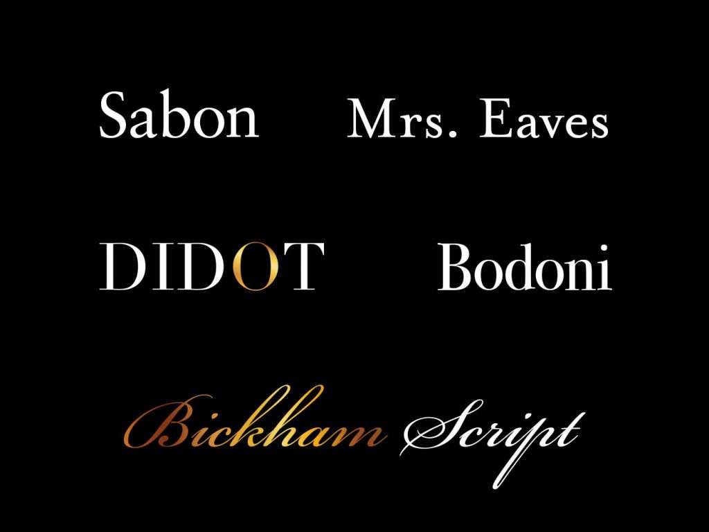
Font-wise if you’re looking for that middle ground gold I described, I’ve found it’s best to go with a classic serif font such as Sabon or Mrs. Eaves. For a trendy-fancy style try Didot or Bodoni. And for an elegant style, a classic cursive font such as Bickham Script should do the trick.
All said this article shouldn’t act as a strict guide but more a general reference if you get stuck. Every project is different and has different needs. I’d just like to share what I’ve found through my experience so far.
@joekotlan on X